

User Experience & Design Leader
- Houston, Texas, United States
- 500+ connections
- Contact info
About
Driven by complex challenges and an unwillingness to accept “it’s not possible,” I am a versatile leader passionate about delivering comprehensive design and user experience solutions. Blending a diverse skillset in design with strong technical leadership cultivated from a broad educational foundation, including a study of psychology, I excel at facilitating business growth and resolving stakeholder needs.
I thrive in high-pressure environments where I diligently steer teams through all phases of UX, visual & interaction design, e-Commerce, and digital marketing projects. An award-winning designer, I elevate brand awareness using media, including print, web, and video, in traditional and digital channels. Fusing multidimensional thinking with an ability to easily “connect the dots” between different ideas, I quickly discover and gain an understanding of new resources needed to address project issues.
A champion for mentorship, I believe success comes from building an empowered team that receives credit where it is due. Leading by example, I promote continuous skills development to position individuals for existing and long-term career growth.
Intelligent Distribution™
Smith navigates unique customer needs to provide seamless global electronics sourcing and logistics in any situation.


Smith Quality
Smith’s quality practices innovate as fast as the technology around us, with constant diligence, growth, and attention to detail keeping us at the industry’s forefront.
Supply Chain Services
We offer customizable service programs to support your most complex needs and supply chain situations. We’ll help you succeed.
Why Smith
A strong foundation meets constant innovation and the best people and practices in the industry. Discover our support and solutions.
Global Locations
With 16 locations worldwide, Smith is at home all over the world, offering localized support to our customers.
Leadership
Whether they’re bringing thirty years of tenure or a fresh face and outlook to Smith, our executives lead with drive and vision.


Multi-restaurant Ordering for DoorDash — A UX Case Study

Larry PeltyAug 26, 2020·11 min read
Hey DoorDash…so how does one order from more than one restaurant at the same time?
Unfortunately, you can’t. At least not yet.
Seven weeks ago, I began a journey to (at least my slightly younger self hoped) figure that out. DoorDash, one of the most well-known food delivery service apps that is available in more than 850 cities nationwide, assumes that I want to order from just one restaurant.
But what if I want Chicken Koobideh for dinner and and a pint of Netflix and Chill’d for desert? Much like the other food delivery apps on my iPhone, the answer was simple.
Place two orders.
Searching for the perfect restaurant, finding just that right flavor, adding it to the cart, checking out, selecting my delivery time, picking my tip amount, choosing my credit card, and last but not least, hitting that big bright orange Place Order button that will have my favorites at my door in no time. Times two.
So how did this all start?
Before this particular project began, I was working with three other talented students in a research class in the Maryland Institute College of Arts’ Master of Professional Studies in UX Design program. Our goal? Evaluate a problem statement presented by one of the group around communications issues when order problems occur using DoorDash.
While pursuing a deeper understanding of the problem through twenty interviews and many hours of analysis, we uncovered some interesting pain points and challenges beyond our initial problem statement, ultimately leading me to a question that I, with a little help from IDEO’s Design Kit, determined how to ask.
How might we allow customers to order from multiple restaurants at the same time?
It was a challenge that I, having kids of my own with completely different tastes, had also experienced. As for my plan over the next several weeks? Figure out a way to order from more than one restaurant while maintaining the experience that millions of DoorDash users already know.
And so my goals, quite simply, were:
- Design a method for customers to order from more than one restaurant at the same time on DoorDash. Get your Chicken Koobideh AND that pint of Netflix and Chill’d.
- Extend the existing interface without redesigning it. This needs to feel like a natural, seamless, extension to the app.
There are more than you might think.
Following our initial research interviews, my diligent classmates and I developed two personas in what we defined as our Hungry Customers audience profile.
We also uncovered that some DoorDash users, who are often balancing the wants of other family members in their orders, were frustrated in having to complete the order process multiple times if they wanted dishes from different restaurants.
“I don’t like that there’s no multiple restaurant shopping cart to be able to pay for all things at once. I have to do multiple orders and go through the process over and over.”
– Quoted from an interview on June 6, 2020
And the same challenge was also expressed by others leading to the creation of our aptly named Variety Victoria persona.

Of course our two customer personas were not alone. We also developed others for the DoorDash delivery drivers (or Dashers) and restaurant workers who take the orders. But as this particular idea piqued my interest, I decided to head in a direction that might (hopefully) solve one of Variety Victoria’s challenges, and my own.
My journey begins.
While my other three stalwart group-mates each focused on their own “How Might We” questions, I set off on my own path. I knew I needed to better understand the DoorDash app and all of its interactions, figure out the areas of opportunity, check out competitors, find those unique features that might influence my designs, sketch some ideas, wireframe the heck out of whatever I might come up with, build a dazzling prototype and…oh yes….test it with real users…in a matter of weeks.
Yikes.
A Challenge assigned.
As the project began, I already knew that each step of it would be constrained by time. The class was only 8 weeks long and there was a lot of work to do.
“There’s nothing like a good challenge to get the creative neurons firing.”
– Me, just now
But more than that, COVID-19 was rearing it’s ugly head across the world. And that would undoubtedly mean that any research, interviews or usability testing would have to be virtual.
Challenge accepted.
And here’s how it all came together.
In the beginning, there was the How Might We question. And it was good.
Well, I think so at least.
Step 1: Determine the order processes and any areas of opportunity to focus on.
Referencing the audience profiles and personas created previously for customers, drivers and restaurant workers, I evaluated the actors in the current DoorDash ordering process. Making some assumptions based on prior interviews with each, as well as my own experience with technical projects, I mapped the approximate process connecting them all through a fourth actor, the DoorDash platform, that facilitates the order flow and communication.
Next, extending the existing order process, I considered a repeating cycle of ordering: find a restaurant, select a dish, add to cart. Repeat.
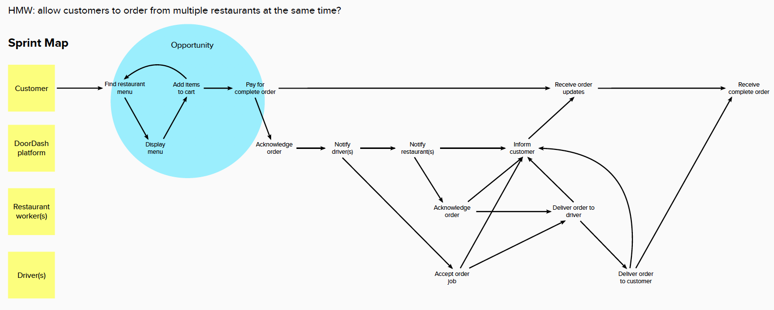
Of course, this led to a new question: how many restaurants might one desire to order from in a single order? I would need to address that question at some point.
As the goal of ordering from more than one restaurant is complicated by the relative distance of restaurants from each other and the customer, it became apparent that more than one driver may be required to facilitate the multi-restaurant order. Thus, how often a customer repeats the add to cart cycle, the number of restaurants chosen, the relative distance and driving time, and the selected delivery times would need to be processed by the DoorDash platform to determine the number of drivers required. And to make this process seamless and easy for the customers, the DoorDash app would need to provide the appropriate feedback to the user about the whole process from start to finish.
Step 2: Evaluate competitor and influencer applications for potential ideas or insights.
Finally putting pen to paper, I looked at direct competitors like Postmates, indirect ones like Instacart and Shipt, and other applications that I had hoped might inspire me in different ways. For these, I looked at apps like Amazon (both standard and Prime Now apps) and Yelp.
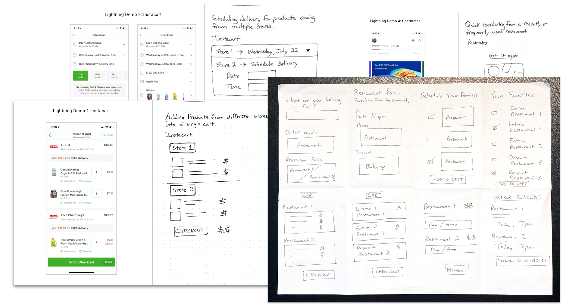
Drawing out ideas through lightning demos and crazy 8s, I began to visualize different methods for DoorDash users to quickly order from multiple restaurants, find their favorite restaurant pairings, view the cart and, of course, schedule multiple deliveries.
While several of the ideas were not explored further, I recognized a wealth of possibilities arising from that single premise of multi-restaurant ordering.
Step 3: Develop wireframes demonstrating a hypothetical user flow of ordering from multiple restaurants.
By this point, I had a good understanding of the singular order flow and how I was conceptually thinking of extending it into a repeatable cycle. I also had rough sketches of how to approach this challenge. And of course, having run through the app numerous times, I was also quite familiar with the standard message DoorDash gives you when you want to add a dish from another restaurant.
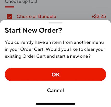
To create an alternative outcome, potentially leading to additional add to cart actions instead of a “let’s start over” stopping point, I needed to utilize one of the best tools in a UX Designer’s toolkit: wireframes.
Keeping my second goal firmly in focus (let’s extend, not redesign!), I started mapping out the normal order flow via low-fidelity mockups in Sketch, my favorite design tool for Mac. This allowed me to visualize the order process and determine the necessary areas to extend as the design process moved forward. With additional interactions then added, I was finally a step toward my goals.

Now that I had my wireframes in place, next would be working in higher fidelity. DoorDash’s brand is distinct and therefore the mockups required the same look and feel (or as much as I could determine visually and via brand research) as their released mobile app.
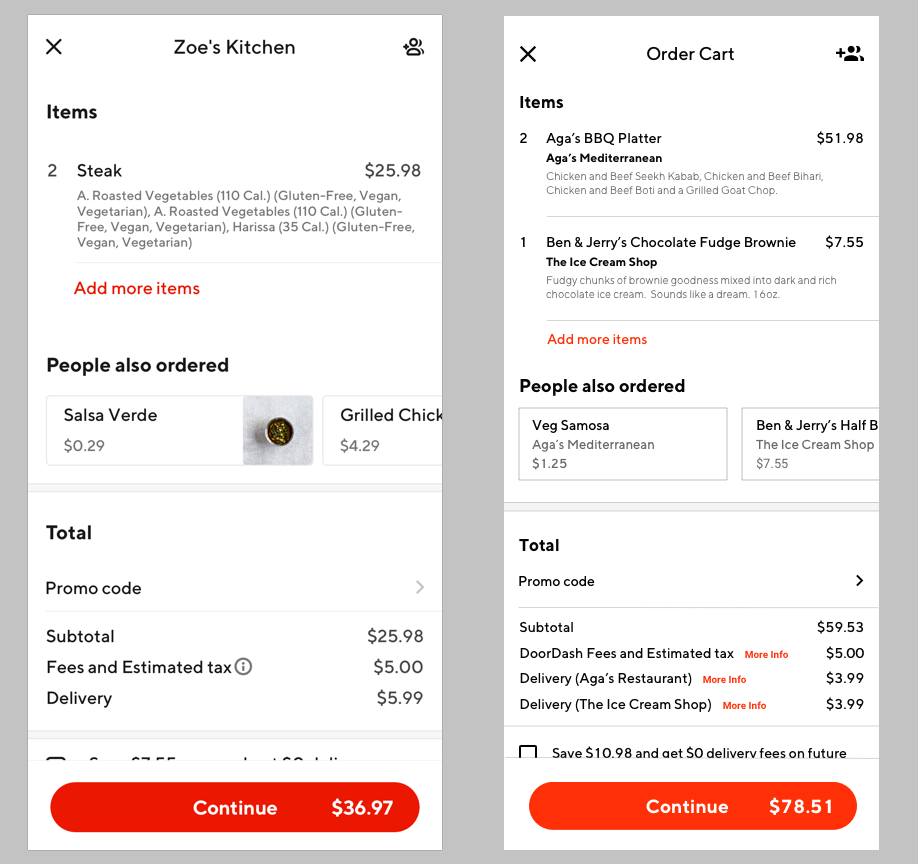
First, I extended the existing primary checkout action button to transition to the number of restaurants added which allowed for the continuation of the ordering process. This resulted in an alternative display of the cart button once another restaurant was being ordered from. I also slightly enhanced the visual display of the number of items added to create a better hierarchy.
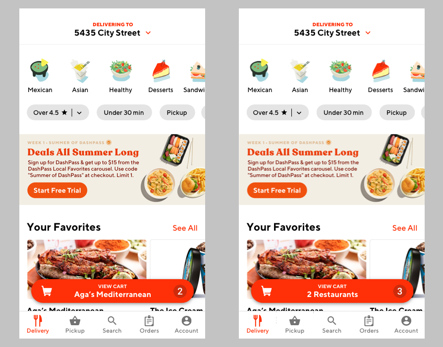
Next, I worked on how to hierarchically display more than one restaurant along with the associated dishes when viewing the cart. Thinking back to my interviews, I followed a core assumption that, I hoped, would minimize cognitive load: customers will more easily remember their large margherita pizza, two bacon cheeseburgers (hold the tomato), and four red velvet cupcakes versus Russo’s Pizzeria, Bob’s Burger Joint and Crave. One has you salivating in anticipation, and the other….wait…is that Crave with a C or a K?
And so, DoorDash’s current cart hierarchy of:

became:

The resulting structure change led to an enhancement in how items would be displayed in the cart, keeping the customer’s desired items in front.
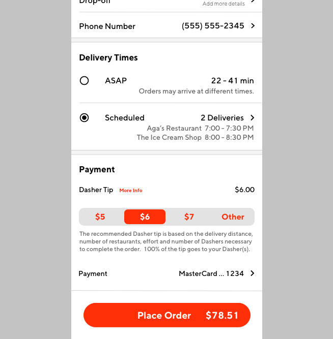
And, finally, I reached the pièce de résistance — scheduling multiple orders. DoorDash’s time selection options are simple: as soon as possible or a scheduled time easily set with swiping actions. Today? Tomorrow? 7–7:30pm? Easy. But what about adding another dimension to this — not just one restaurant but perhaps several?
Enter one of my influencers, Instacart. With a multiple store shopping cart, a customer has the ability to set a day and time for each store delivery. Want your groceries this afternoon and your alcohol store delivery tomorrow? No problem.
Following an evaluation of Instacart’s scheduling options, I further extended DoorDash’s scheduling flow with additional swipe and touch actions for selecting the day or date, while maintaining the existing swipe actions for choosing the time window.

The rest seemed easy from here. Maintain the final order flow and user feedback, ultimately bringing the customer to the order status screen as they eagerly await the driver’s knock on their door.
Next up: time to prototype this thing. And, of course, make it dazzling.
Step 4: Prototype the extended ordering process
DoorDash’s interactions are aplenty. Want to start off searching for your personal favorites? Sure. Looking to peruse the ever-changing delivery screen of delectable goodness? Of course. Looking to reorder last Saturday’s ludicrously large lunch? Absolutely.
To really test the functionality of ordering from more than one restaurant, those interactions needed to be considered. I wanted users to feel like they are using the app, hopefully finding that blissful moment of delight when they realize they aren’t stopped after a single restaurant’s dishes have been added to the cart.
Thus, after many hours of creating screen mockups and variations to reflect the subtle interactions, my prototype was born. Huzzah!https://cdn.embedly.com/widgets/media.html?src=https%3A%2F%2Fwww.youtube.com%2Fembed%2F-WEB4upDc-E%3Ffeature%3Doembed&display_name=YouTube&url=https%3A%2F%2Fwww.youtube.com%2Fwatch%3Fv%3D-WEB4upDc-E&image=https%3A%2F%2Fi.ytimg.com%2Fvi%2F-WEB4upDc-E%2Fhqdefault.jpg&key=a19fcc184b9711e1b4764040d3dc5c07&type=text%2Fhtml&schema=youtubePrototype demonstrating multi-restaurant ordering capabilities.
With my first prototype eager to be seen, it was finally time to find some DoorDash users to test it with.
Step 5: Evaluate the prototype through usability testing
To prepare for the testing, I recruited seven users through my own network of friends and acquaintances who had used, or are currently using, DoorDash. A test plan was written with five tasks to complete and eight initial follow-up questions to ask based on assumed outcomes of the test. Remember that question about the number of restaurants I mentioned before? Now was the time to ask it.
Each session was handled virtually using Zoom using computers with attached webcams for both the participant and I. Permission was also gained prior to each recording, allowing for a more in-depth analysis at a later time.
Following each usability test, qualitative data was captured in regards to the quality of each session, any opportunities or pain points observed or discussed, along with key takeaways from the follow-up questions.

The discovered opportunities and pain points were also grouped and evaluated by the number of appearances in each session, potentially providing additional areas of focus in future revisions of the prototype.
Step 6: Revise the prototype based on qualitative research data
Whew! I made it this far….I’m done right? How ‘bout a big bucket of nope.
During the testing, a few pain points emerged that I wanted to immediately address, primarily around providing an improved amount of detail in regards to fee breakdown (keeping in mind the fees charged by different restaurants) as well a clearly indicating the scheduled times prior to moving forward in the checkout.
I also further extended the ASAP option with an additional message to inform customers. As the ASAP time window would incorporate one or more restaurants, I assumed an additional need to indicate that the orders could arrive at different times, as more than one driver may be required for those deliveries.
What I learned in my journey well traveled.
And like a blink of any eye, seven weeks have past.
Going from a single question to a tested prototype brought even more interesting ideas to consider. And best of all, extending the design of the DoorDash app to include ordering from multiple restaurants resulted in positive feedback from each of the tested participants.
”It was nice that I could seamlessly add items from different restaurants and check out.” — Quoted from an interview on August 11, 2020
Through the usability tests and subsequent discussions with the users, I believe that the process defined for multiple restaurant orders within the prototype was validated with only minor modifications made. While there was not enough time in this project to dig even deeper, additional opportunities and pain points were uncovered in regard to navigation and fee calculation which should also be explored in future research, prototyping and testing.
Additionally, an enhancement was also suggested to allow users to have different restaurant orders be sent to different addresses, while still handling it all in a single order.
So what’s next?
I believe that this enhancement could be a significant advantage for DoorDash, and as such, I would recommend a technical review to evaluate methods of managing one or more drivers handling multiple orders submitted by customers.
Additional design iterations should also be completed to explore the suggested enhancement of selecting different addresses for a multiple restaurant order. Lastly, additional usability tests should also be scheduled to evaluate the updated prototype.
And with that, I close out this project with one of my favorite literary lines: mischief managed.
Have any feedback or just want to say hello? Reach out to me on LinkedIn.
Note: I am not affiliated with DoorDash in any way.
WRITTEN BYLarry Pelty